The One Typography Habit Making Your Content Look Amateur
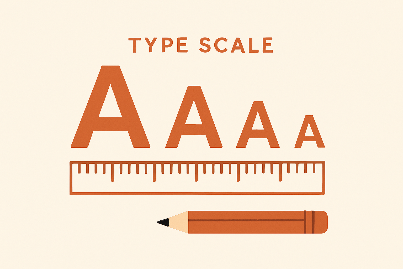
Here's a signal you can spot in about two seconds on any website: a default typeface, paired with no other typographic decisions. No scale. No intentional weight changes. Just one font size doing everything from the hero headline to the footer text.
That's not a small detail — it's a strong tell that the design was never intentionally styled. And visitors register it instantly, even if they couldn't explain why.
The prompt that fixes this
"Act as a typography director. My site currently uses [describe fonts]. Give me: a font pairing that feels intentional instead of default, a full type scale for headings, subheadings, body text and buttons, the right line height and letter spacing for each, and the ONE typography habit that makes even good content look amateur."
The key phrase is "give me numbers." Not "make it feel more premium" — give me a scale you can implement in the next ten minutes.
A type scale you can copy right now
| Element | Size | Line height | Letter spacing |
|---|---|---|---|
| Display / Hero | 48–58px | 1.05 | -0.02em |
| H2 | 32–40px | 1.15 | -0.01em |
| H3 | 20–24px | 1.3 | normal |
| Body | 16–18px | 1.6 | normal |
| Button / Label | 13–14px | 1 | 0.06–0.12em uppercase |
The ONE habit that ruins even good content
Using the same font weight for everything. When your headline, your subhead, and your body copy are all "regular 400 weight," nothing stands out — the page reads flat no matter how good the writing is. Fix: bold headlines (700–800), medium subheads (500–600), regular body (400).