Why "Empty" Is the Most Expensive Word in Web Design
Most people fill empty space because it feels unfinished. That instinct is the single fastest way to make a website look cheap.
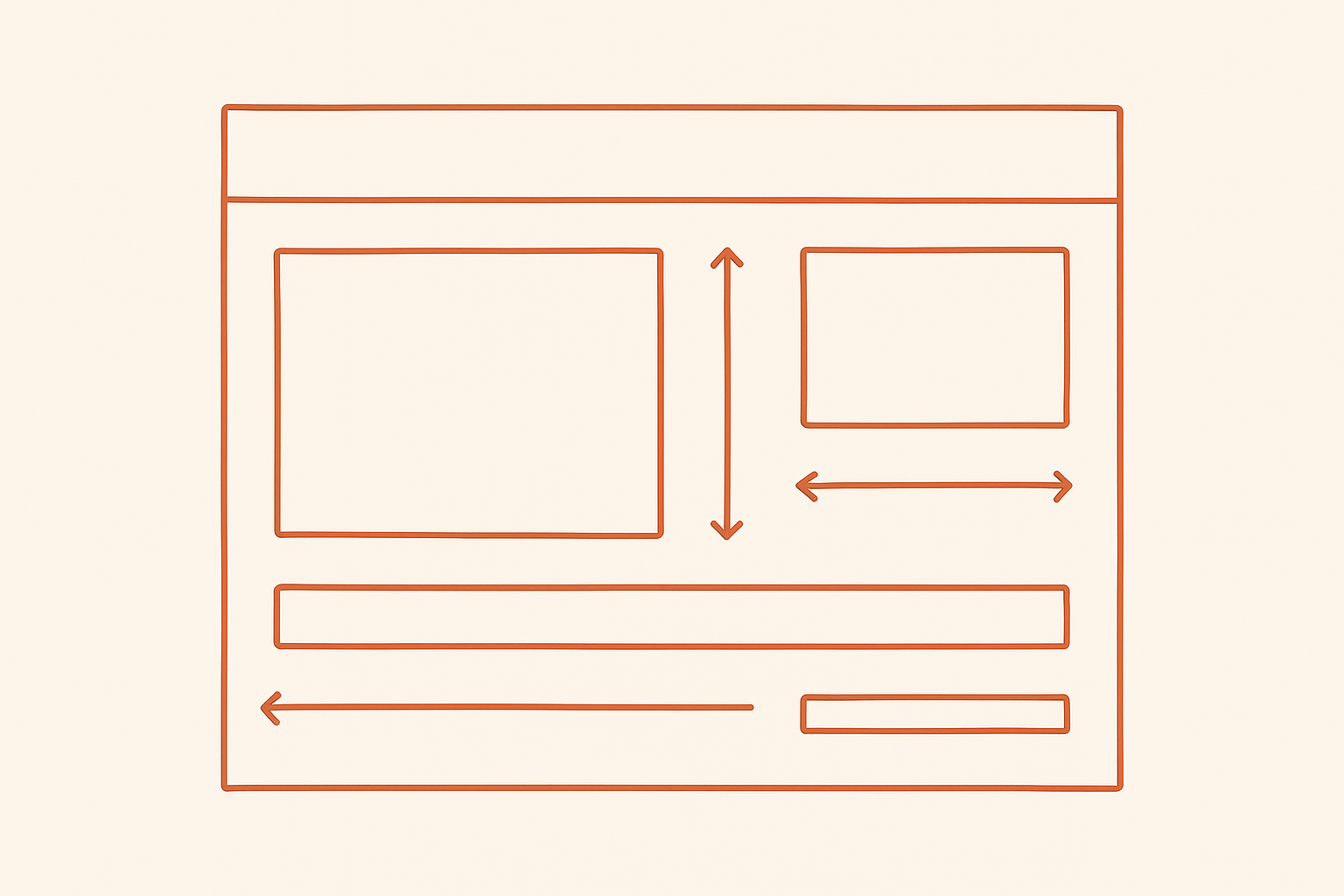
Strategic white space doesn't waste real estate — it creates the visual breathing room that improves readability, guides attention, and communicates sophistication. Studies on layout comprehension show that generous, intentional spacing increases content comprehension by 20%. Your visitors read less text and understand more of it. That's not a coincidence — it's design doing its job.
The prompt that fixes this
Run this against your actual homepage, not a hypothetical one:
"Act as a layout critic reviewing my page: [upload screenshots]. Go section by section. Tell me: where it feels cramped, where it feels empty in the wrong way, the exact spacing changes that would make it feel more expensive, and why generous white space is one of the fastest signals of a premium build."
Notice what this prompt does that "make it look nicer" doesn't: it forces a section-by-section pass, and it asks for the difference between good empty space and bad empty space — because those are not the same thing.
Cramped vs. empty in the wrong way
- Cramped: text touching the edge of its container, buttons stacked with no gap, headlines sitting directly on top of body copy with no vertical rhythm.
- Empty in the wrong way: a section with nothing to look at — no anchor point, no hierarchy, just dead space that reads as "unfinished" rather than "intentional."
The difference is whether the space is doing work. Good white space separates ideas and directs the eye. Bad white space is just a gap where content should have been.
Three spacing changes that instantly read as "expensive"
- Increase section padding. Most DIY sites use 40–60px between sections. Premium builds use 90–140px. The extra room alone changes the whole feel.
- Give headlines their own vertical rhythm. A heading needs more space above it than below it — that's what tells the eye a new idea is starting.
- Widen the gutter between columns. Cards or columns crammed together read as a spreadsheet. 24–40px of breathing room reads as a layout.
This is one of the 7 prompts from the full series — paired with the other six, it's the fastest way to go from "obviously AI-built" to "obviously a studio built this."
← Back to all 7 prompts